East Guardian Logo

Graphic identity for real estate investment company East Guardian

East Guardian Immobilen AG (EGI) is a real estate investment company that has been active in the DACH region and in particular Germany since 2013.

They aim to be an integral part of the local community and develop sites in close cooperation with local authorities and interest groups.

Glauser Creative helped out in creating a graphic identity that also included East Guardian Asset Management.

The logos for East Guardian Asset Management and East Guardian Immobilien share the same symbol and font but using different brand colors.

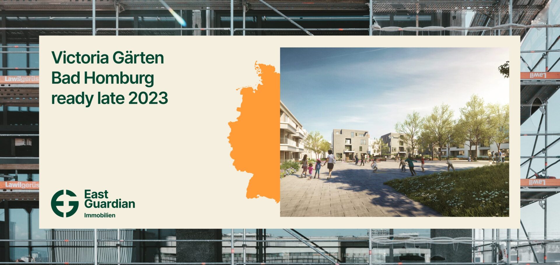
The identity consists of a simple symbol combining the letters E and G together with a font and a color scheme. Using bold clear graphics together with images to create a distinct identity.

Bold and colorful graphic design for East Guardian
Clear and bold graphic shapes are used to create strong identity.
Example applications for East Guardian
Examples of applications from the brand manual.
How the design and typography can work together with colors and images to create an identity.
The identity is a combination of clear bold graphics, a simple color scheme, project images, the font Inter Semi Bold and the logo.