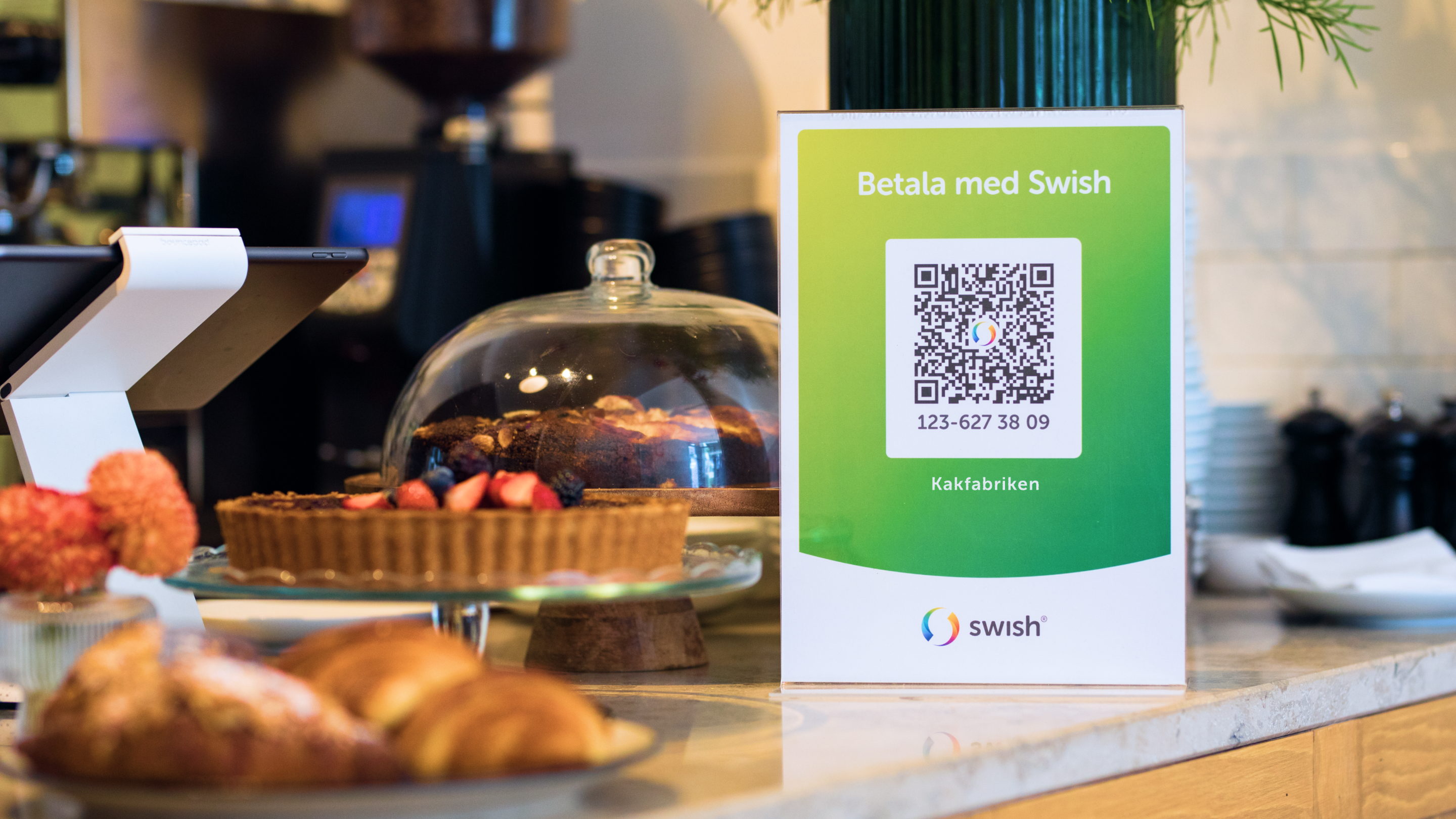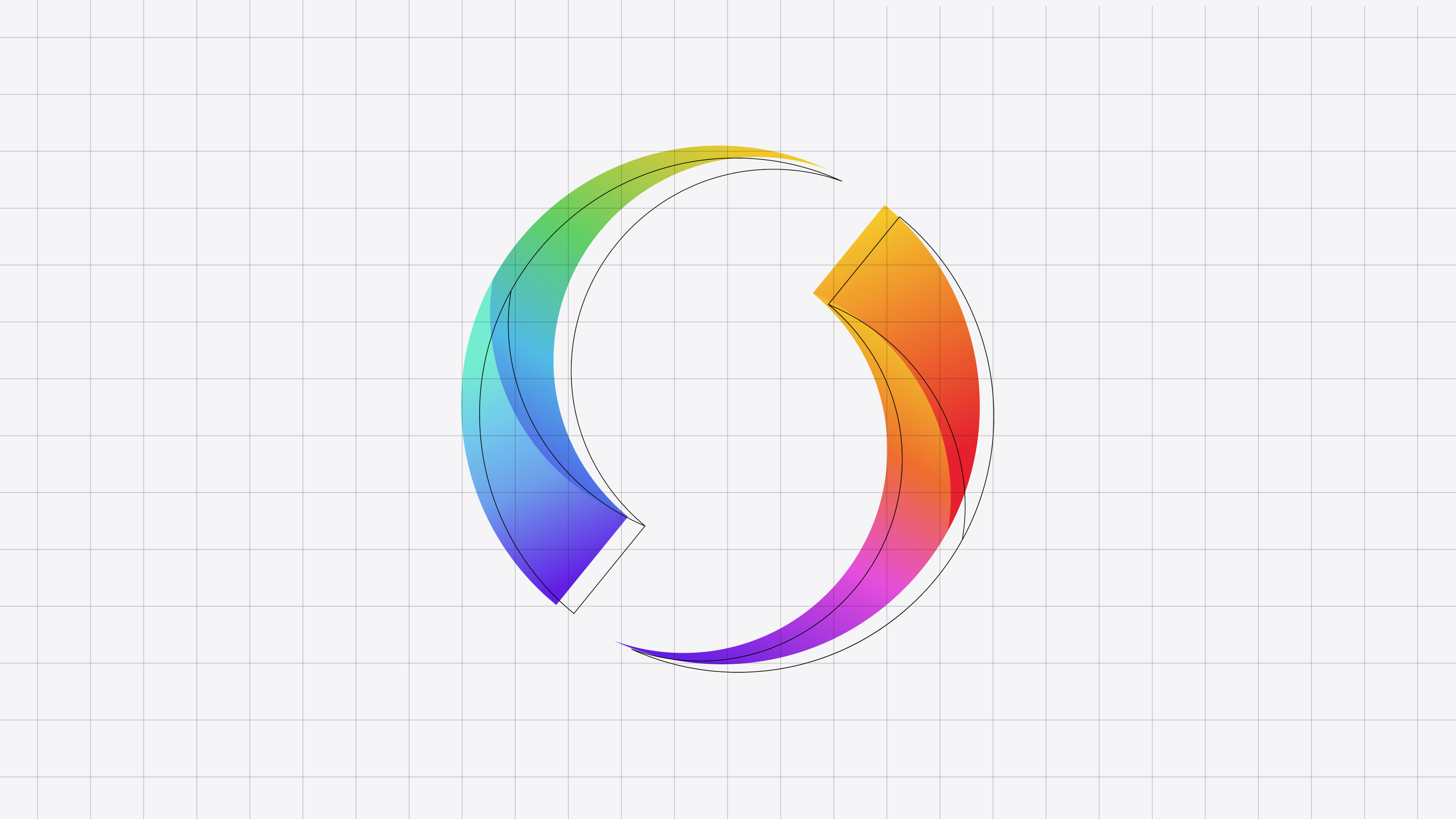
A more distinct brand for the largest payment service in Sweden
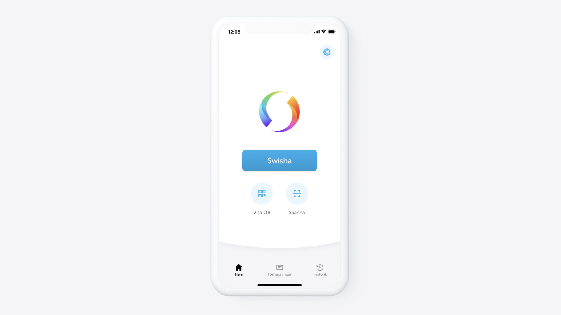
With more than 7 million users Swish is one of Swedens most loved brands. Swish started out as an app from some of Swedens largest banks to handle peer to peer payments and was wildly successful from start as it met a clear user need in a good way.
As Swish added support for businesses to use the tool for in store payments and ecommerce they saw the need to update the brand.
Glauser Creative helped the company adjust the logo and brand to better work in digital environments, created templates for social media and presentations and also created new more defined brand guidelines that was easier to work with.
Swish is still growing, with more transactions being made than ever before.
Also read about how I helped Swish with a new and green design.