How to pick the right fonts for your brand
Fonts. They’re everywhere. From the logo on a website to the text in a brochure, they play a crucial role in defining a brand’s identity. But how do you choose the right one? We’ll explore what to think about when it comes to character, readability, and uniqueness.
Fonts and character
Every font has a personality. It tells a story. It conveys emotion.
Serif fonts like Times New Roman? Traditional. Respectable.
Sans-serif fonts like Arial? Modern. Clean.
You’ll want to think about your brand’s personality when choosing a font. Are you playful? Elegant? Edgy? Choose a font that reflects that.
Readability matters
Fonts need to be read. Sounds obvious, right? But it’s not always easy.
Cursive fonts may look beautiful but might be hard to read. Small fonts? They can strain the eyes.
Choose fonts that are clear. Legible. Easy on the eyes. Think about where it’ll be used. On a billboard? In a blog post? The context matters.
Being unique without being overbearing
Want to stand out? A unique font can do that. But be careful.
Too unique, and it might become distracting. Or unprofessional. You want a font that’s distinct but not overpowering.
Consider custom fonts. Something tailored to your brand. But keep it balanced.
Examples of brands using fonts effectively
Need inspiration? Here are some brands that nailed their font choice:
- Google: Simple. Approachable. They use a customized version of Product Sans called Google Sans, which is modern and uncluttered.
- Coca-Cola: The cursive logo font, Spencerian Script, is iconic. Recognizable.
- The New York Times: Classic. Authoritative. Their serif font, Cheltenham, conveys trust.
- Airbnb: Bold and friendly. They use a custom-made font called Cereal that feels welcoming.
- IBM: The company uses Plex Sans, reflecting its tech-savvy, professional image.
- Netflix: Netflix’s custom font, Netflix Sans, is sleek and modern, fitting its innovative brand.
- Visa: Utilizing Helvetica Neue, Visa conveys a sense of simplicity and reliability.
- Vogue: The elegant Didot font is used by Vogue, perfectly complementing its chic and stylish brand identity.
- Mercedes-Benz: The luxurious Corporate A BQ font captures Mercedes-Benz’s premium, sophisticated image.
- Gucci: By using the elegant Gotham font, Gucci aligns with its sleek and fashionable image.
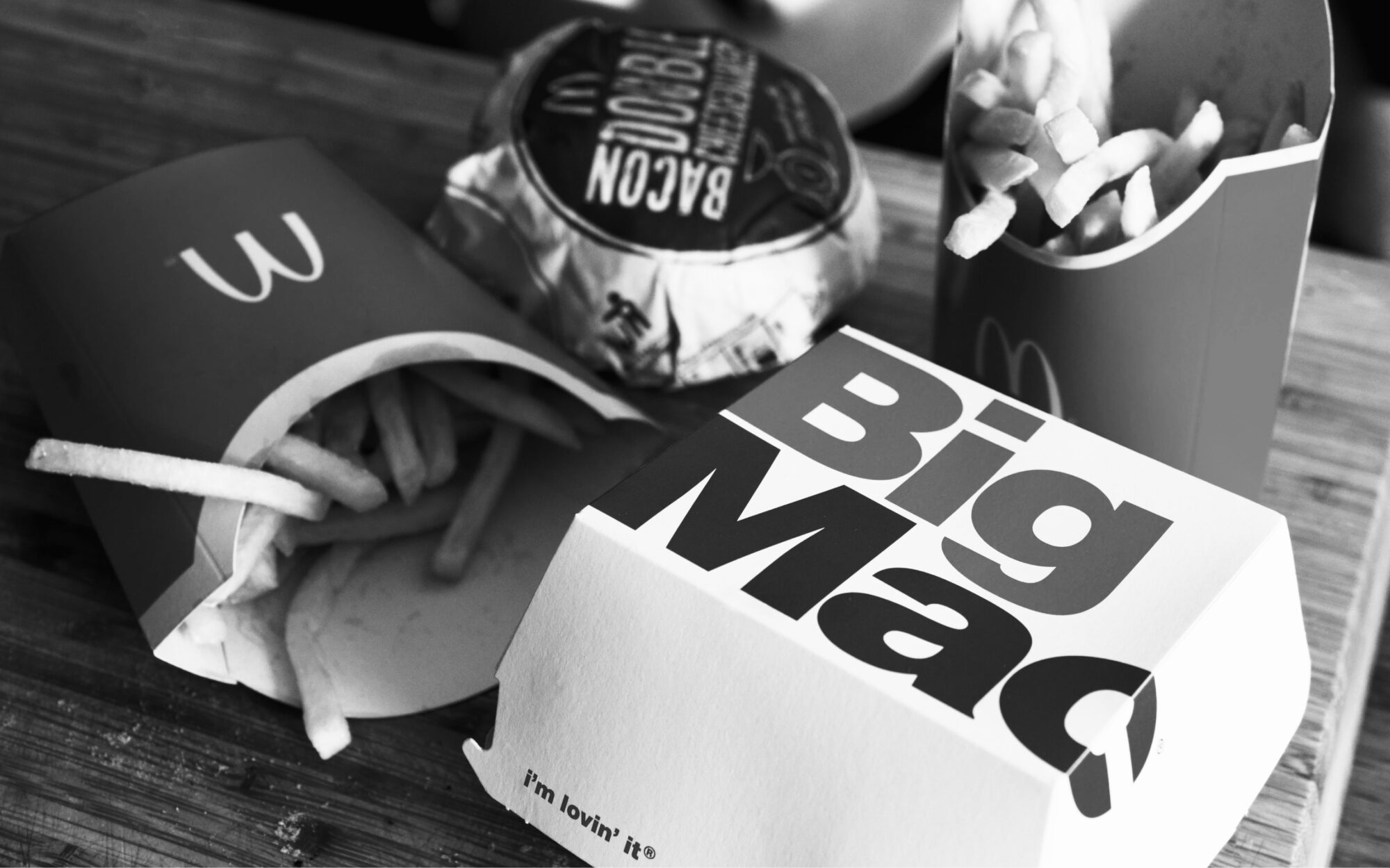
- McDonald’s: The fast-food giant employs Helvetica Black in its branding, reflecting a modern and bold approach.
- Adobe: The software company uses Myriad Pro in its branding, communicating clarity and innovation.
- Volvo: With the Futura font, Volvo presents an image of simplicity and efficiency, in line with their engineering excellence.
Combining fonts
Using more than one font? It can work. But it’s tricky.
Pair fonts that complement each other. A bold headline font. A simple body text font. Keep it harmonious.
The technical side of fonts
Think about where your fonts will be used. On a website? In print? Make sure they’re compatible. Make sure they load fast online. Technical details matter.
Picking the perfect font for your brand
Fonts are more than just letters. They’re a vital part of your brand’s voice.
Consider the character. Focus on readability. Be unique, but not overpowering.
Pick the right fonts, and your brand will speak volumes. It’ll be memorable. It’ll resonate with your audience.
So next time you’re pondering over fonts, remember, it’s not just about what looks good. It’s about what feels right for your brand.
Looking for more font inspiration?
Also read Free fonts are fantastic for your form